ng-toggle-button
I have developed an Angular component that can be used in your projects, this is a switch or toggle button, it is a kind of checkbox. You can see and test the demo.
Motivation
Some time ago, I was working on a project that involved an admin panel developed in Angular. When updating its version, some conflicts appeared with certain dependencies. However, there was one strange error in particular. When building, the console displayed the message: angular is undefined, which was a bit odd. After searching for a while, I couldn’t find the origin of the error. I concluded that the error might be related to one of the dependencies, but which one?
I was able to identify the problem, the problem was one of the libraries used by the application, a checkbox switch toggle component. I looked for alternatives but didn’t like any of them, so I thought, why not create my own component?
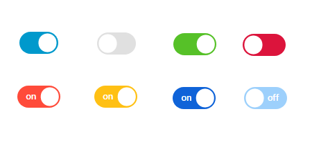
Inspired by a component from Vue.js, I created this component compatible with the Angular version of the project. After building the component, I uploaded it to npm and installed it as a project dependency, replacing the previous library.
The purpose of creating this library was not only to solve the current problem in the project, but I also wanted to publish a package and start an open-source project, and this was a great opportunity.
Lesson Learned
By working on this project, I learned how to develop a library or package for reuse in other projects.
How to use
First, intall the dependency:
npm i ng-toggle-button
o
yarn add ng-toggle-button
Then, import the module
import { NgToggleModule } from 'ng-toggle-button';
@NgModule({
  ...
  imports: [
    ...,
    NgToggleModule
  ],
})
and use
<ng-toggle
  [value]="true"
  [color]="{
    unchecked: '#939da2',
    checked: '#f62d51'
  }"></ng-toggle>
You can learn more in the project’s repository.